In this post, I will discuss a disparate series of charts that have caught my attention this weekend.
First, we have a daily chart of the S&P 500:

What I find noteworthy is the extreme selling volume that took place on Friday. Also, notice the bearish black candle that form on that day. It is true that one bearish candle on one daily chart could just be noise, but other pieces of evidence appear to be lining up as well...
Second, let us examine what has been the leading sector propelling the American market higher: biotech.

The daily chart above illustrates the price of IBB (the Biotech ETF) slicing through the 50 day moving average. This fact makes this ETF unbuyable for me, since it breaks Trend Commandment #3 (see previous post). Furthermore, it did so on the highest volume in years.
Zooming out, we have next a weekly chart of IBB:

Notice the last 4 bars of immense selling volume.
Zooming out further still, we now have a monthly chart of IBB:

When I enter a position, I am looking for what is known as an asymmetrical risk to reward relationship. In other words, if I am wrong (and I am wrong a lot), I want to lose very little, but in the event that I am right, I want the potential gains to be extremely high.
This ratio of low risk and high reward no longer exists with IBB, and the relationship is now one of extreme risk, but, like any bubble, potentially high reward. This is not a combination that I am seeking to trade.
The fact that the market's hottest sector is looking particularly vulnerable is problematic, but it gets worse. Globally, other markets as a whole are looking weak.
Moving on, below is a chart of the Japanese Nikkei:
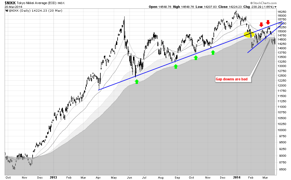
Admittedly, the Japanese stock market appeared bullish to me at the end of last year, but as the facts (the price action) changes, so must my opinion.
This whole enormous consolidation pattern has tragically (for the bulls) broken down hard. The price action has gapped down, and the long term moving averages are rapidly closing in on each other, which would usher in a full blown bear market.
And it is not just Japanese stocks, but also German stocks that look sickish to me:

Finally, here is a monthly chart of copper:

As a trend following trader, I am attracted to higher highs, and higher lows, which is why copper is something that I have no interest in buying. At this current moment in time, copper is trading at a 3 year low, while also completing a massive head and shoulders-like top.